Email Creative
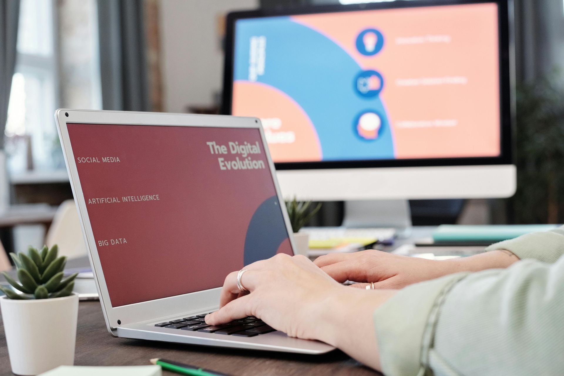
In email marketing, it's crucial to minimize content and increase send frequency for better engagement. Emails should be enticing and get straight to the point. However, it's also important to avoid sending too many emails, as this can result in inbox fatigue. To prevent this, large emails should be divided into smaller segments.
One effective strategy is to apply the "rule of 6," dividing a large email into six smaller ones as a journey. This helps to maintain a healthy balance between email frequency and content.
Rule of 6
- Email 1: Introduce a product, webinar, or service that can be beneficial to our clients. Allow a 7-day interval between sends.
- Email 2: Entice the audience by citing positive feedback, such as "96% of our clients found the Introduction to rradar services helpful and engaging." Allow a 7-day interval between sends.
- Email 3: Highlight the benefits of attending the webinar and its purpose. Allow a 7-day interval between sends.
- Email 4: Address the potential consequences of not registering for the webinar by using fear-based tactics, such as "worried about the impacts of coronavirus on your business? Register for our webinar." Allow a 7-day interval between sends.
- Email 5: Present the products and services that we offer to clients. Allow a 7-day interval between sends.
- Email 6: Emphasize what the audience stands to lose by not registering, such as knowledge and understanding of a legal situation.
According to a study mentioned in the webinar, typically only 6% of a marketing list registers for webinars. But, with the implementation of the "Rule of 6," this number increased to 40%.
3D Marketing
The topic of 3D Marketing was widely discussed during the webinar, focusing on how it can improve email marketing and overall marketing efforts. The diagram shown below outlines the essentials for becoming a well-rounded marketing entity. The message type refers to the desired outcome and objective. The "Arrange, begin, book" section refers to offering clients opportunities to enhance their knowledge, such as a webinar or meeting with a broker. The "Learn, read, watch" section could include materials such as demos or price lists for customers.
F24 talked about the concept of an email serving as a container for a journey that leads the recipient to another location of interest, like a website. They emphasized the importance of considering what motivates someone to open an email when designing one, using the analogy of an envelope.
During the discussion, the relevance of newsletters was also brought up. It was noted that if the information has already been shared on social media, it's not necessary to repeat it in a newsletter. This ties in with the previous discussions on limiting content and increasing frequency in email marketing, as it was noted that long pieces of content are not added to social media, so there's no need to include them in newsletters. Emails have become much more accessible to create and don't require lengthy approval processes like before.
Email Design
Single column emails tend to have a higher open rate compared to emails with multiple columns. This is because our eyes naturally follow a straight path down the page, and too many columns can be distracting and discourage clients from engaging. F24 recommends using a one-column layout for emails, as this makes them more accessible for mobile users. A case study confirmed that emails with single columns tend to have a higher click-through rate than those with multiple columns, as a single column provides a clearer and more straightforward path for the reader.
Ensure all emails have each of these items:
- Preheader – Needs to grab attention
- Headline – Grab interest to encourage audience to keep scrolling
- Intro Headline – Action, what do we want them to do with this email?
- Creative Sign off – What desire are we hoping to achieve?
- Detail and Action – CTA – what do we want our clients to do/go – purpose of the email – keep interested and some action to be taken.
(Remember; bad content is worse than little content)
Another case study found that having a large banner/image at the top of your email can detract clients as many people judge the entire email by this graphic alone.
In terms of content, limit the number of words accompanying a CTA button to around 10 or less for maximum impact. Keep the content short and sweet to keep the audience engaged. People tend to skim over long paragraphs and retain less information. Two sentences should be the maximum associated with a CTA as it is the main focus.
For email build, work efficiently and use the "Squint Test" before sending. The squint test checks if the message stands out and if it is the main focus, or if it gets lost.
Regarding the use of images, keep in mind that clients won't remember if the same image has been used multiple times in recent emails. Only certain elements are remembered by clients and images are not a significant factor in memory retention.